A navy-on-navy outfit can work. It can also look like a uniform. The difference is almost never color; it's surface. Matte wool against crisp cotton against rough suede gives the eye three things to register. Matte cotton against matte cotton against matte cotton gives it none.
The eye needs something to move across. If everything is flat, the outfit is invisible.
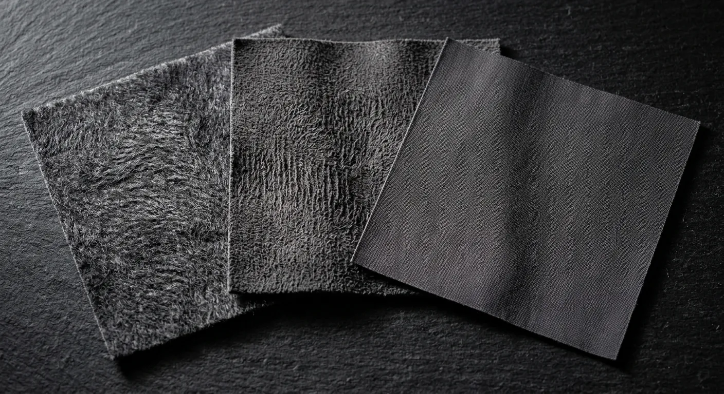
Texture works through contrast, not accumulation. Three rough textures in one outfit cancel each other out. The functional combinations pair one coarse surface with at least one smooth one: a napped flannel trouser against a smooth leather derby; a waffle-knit crew against a twill chino; a boiled wool overshirt against a fine cotton tee underneath. The smooth surface becomes more visible by contrast with the rough one, and vice versa.
Weight matters as much as surface. A 14oz denim jacket over a 4oz poplin shirt creates a visual contrast that a 7oz denim jacket over a 6oz oxford does not, even if both combinations are technically denim-on-cotton. The heavier piece anchors the eye. The lighter piece recedes. That's how a simple outfit reads as composed.
Some combinations that work consistently: brushed cotton or flannel trousers with a smooth leather shoe, no sock (or a fine-knit sock in a matching tone). A rough Shetland wool sweater over a smooth OCBD. A suede jacket over a smooth merino base. A waxed cotton shell over an unstructured knit.
The combinations that consistently fail: fleece on fleece. Knit on ribbed-knit without a textural break. Performance polyester on top and bottom, which reads as athletic even when it isn't. Any combination where nothing is absorbent, which kills the depth entirely.
Buy for weight and weave first, color second. A charcoal outfit in three textures is more considered than a charcoal outfit in one. The eye will know the difference even if the wearer doesn't.